7 Essential Web Pages Your Law Firm Website Needs

You didn’t sign up for a career in web design. Nevertheless, taking ownership of your law firm’s website architecture is a crucial element of growth. Website optimization is both the biggest component and the biggest obstacle of most online marketing strategies for law firms. If a potential client does only one thing to evaluate your law firm, they will look at your website. That’s why law firm websites need to have clear information presented in a clear way.
We’re going to break down seven web pages your law firm definitely needs, with the help of real examples from Lawmatics customers. These examples will demonstrate how your website can tell your firm’s story in showcasing its history, personality, approach, and efficacy.
1 Home Page
First impressions are vital. The Home page will be the first impression for 75% of your website’s visitors. As most if not all of your advertising and online traffic will direct to this page, you’ll want to make sure it’s welcoming, informative, accessible, and sets the tone for your brand. The first goal of the Home page is to communicate what you do; the second goal is to show how you do it. It describes the law firm’s values and practice areas. It’s also an opportunity to validate the quality of your firm’s legal services. An accurate homepage is the best way to qualify leads: visitors who aren’t suitable clients for your service will self-select and not overload your intake process.
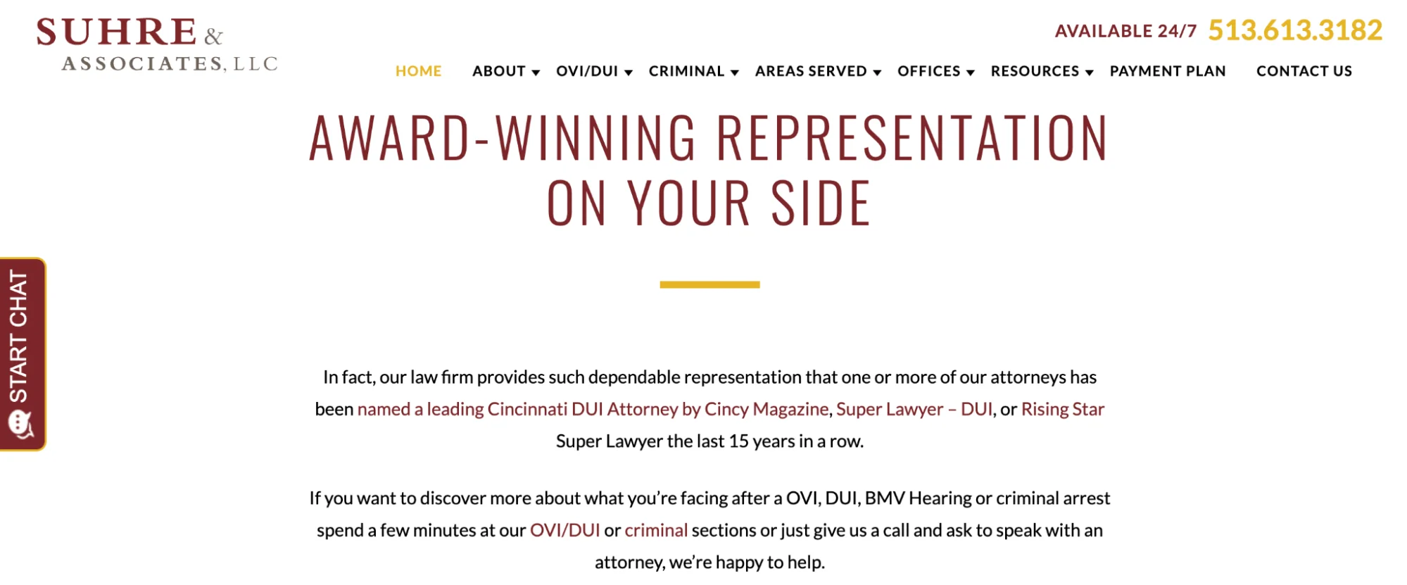
The Home page of Suhre & Associates, LLC highlights the firm’s client testimonials, case studies, and awards. The takeaway from this page is that Suhre & Associates has a history of sustained success representing clients in OVI/DUI and criminal law. After someone reads your Homepage, they shouldn’t necessarily know every little thing about your firm. They just have to know that you’re effective at what you do.
2 About Us
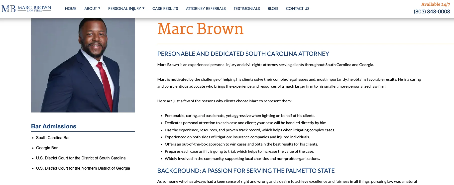
The About Us page is the second-most visited page for many websites, and should include the most detailed information about your law firm. It’s a great place to dive deeper into the firm’s values and story. No matter the size of your firm, tell your firm’s story on this page through its people. Take Marc Brown Law Firm as an example. As a smaller firm, establishing a personal connection is crucial for Marc Brown. That’s why the About Us pages contain detailed biographies, bar admissions, education, professional memberships, and community involvement. This level of personal detail helps potential clients envision Marc as an attorney they can trust.
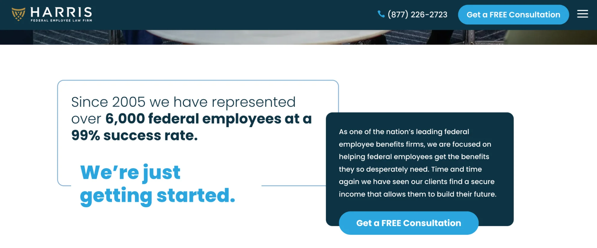
For a large national firm like Harris Federal Employee Law Firm, this may look a little different. In addition to attorney and staff biographies, Harris’s About Us page highlights its measurable impact. This page can effectively assuage concerns a potential client might have about hiring a large national firm. By including the “99% success rate” statistic alongside employee biographies, this page tells potential clients that the firm isn’t an impersonal legal machine; it’s a firm staffed by highly effective and approachable people.
Ultimately, the About Us page is your chance to make the case for why your firm is different from all the other firms. What’s the thing that really sets you apart from your competitors? What makes you stand out?
3 Practice Areas
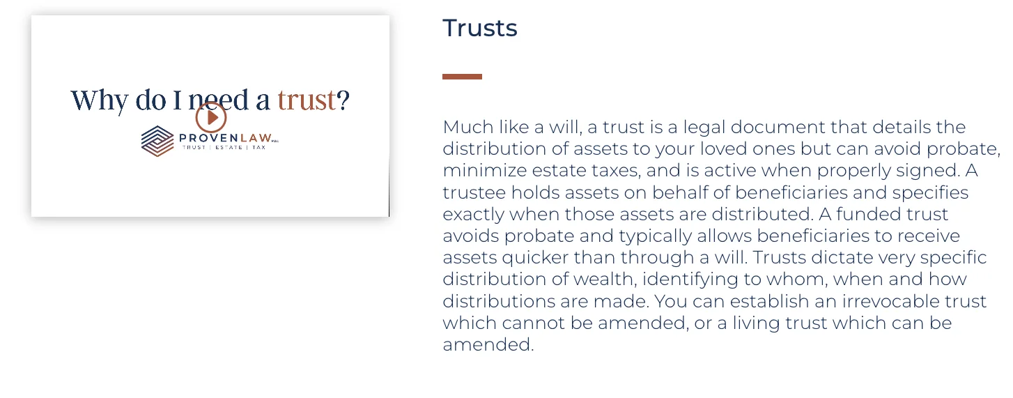
The Practice Area page describes the services your firm offers. Not every client is going to know the exact service they need. That’s why the Practice Area page is both a lead qualifier and an educational opportunity. A potential client might need a way to secure assets for their family, but not know whether they need a will or a trust. In this example from Proven Law PLCC, the Practice Area page provides easily-digestible information about legal intricacies potential clients may not know. This type of Practice Area page establishes the firm as an approachable authority in the area of estate planning and tax law.
If your area of practice has several subdivisions or areas of focus, consider adding web pages dedicated to each of those subdivisions. Incorporate specific phrases like “Wills & Trusts” into your website architecture so visitors can easily identify a service they may already have in mind. Make your website more navigable by not solely relying on overly broad titles like “Estate Planning.”
4 Legal Resources
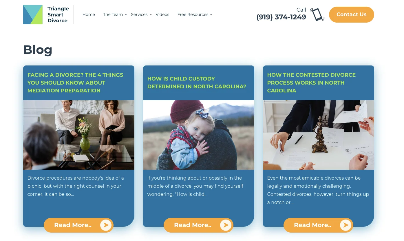
A Legal Resources page employs dynamic educational content. While a Practice Area page may be more concerned with definitions and outcomes, a Legal Resource library shows how your firm thinks. It’s a blend of your expertise and your personality. Triangle Smart Divorce maintains a blog that educates visitors on legal process, practice area insight, and advice for navigating divorce. They also include downloadable resources like e-books and FAQ guides.
5 Case Studies and Client Testimonials
Your firm may be the best, but a prospective client won’t simply take your word for it. Case studies and client testimonials demonstrate the effectiveness and quality of your firm’s services and the overall experience of working with you. The stories of people you’ve previously helped allow potential clients to imagine themselves hiring your firm. Pacific Workers’, The Lawers for Injured Workers, showcases client testimonials in both text and video.
Client testimonials and case studies create what Robert Cialdini called “social proof.” Humans don’t make decisions based purely on statistics and compelling copy. We seek social feedback to shape our understanding of what’s good, normal, and important. If we see that another person in our position hired your firm and it worked out, we can imagine ourselves also hiring your firm and having a positive experience.
Pacific Workers’ supplements these qualitative reviews with a page dedicated to quantifiable results. The workers’ compensation field is heavily driven by outcome. It’s important to show potential clients that they will have a high quality experience and get results. This website strategy may not be applicable to other practice areas, but it’s a good example of a law firm designing their website to meet their unique needs.
Social proof and quantifiable results are crucial pillars in making a buying decision. Transparent exhibitions of your results and process give potential clients permission to trust your firm.
6 Contact Us
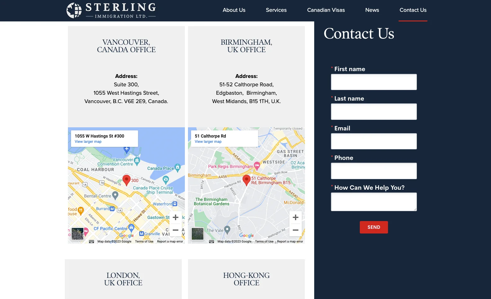
The Contact page must list your firm’s phone number and email address. It should also have a form for visitors to provide their contact information if they’d like to submit an inquiry or sign up for updates from your firm. Sterling Immigration Ltd. also uses this Contact page to list their multiple office locations. If your firm has several office locations, or operates in multiple states or jurisdictions, you may want to consider creating a separate Locations page that explains any differences between office locations.
7 Frequently Asked Questions
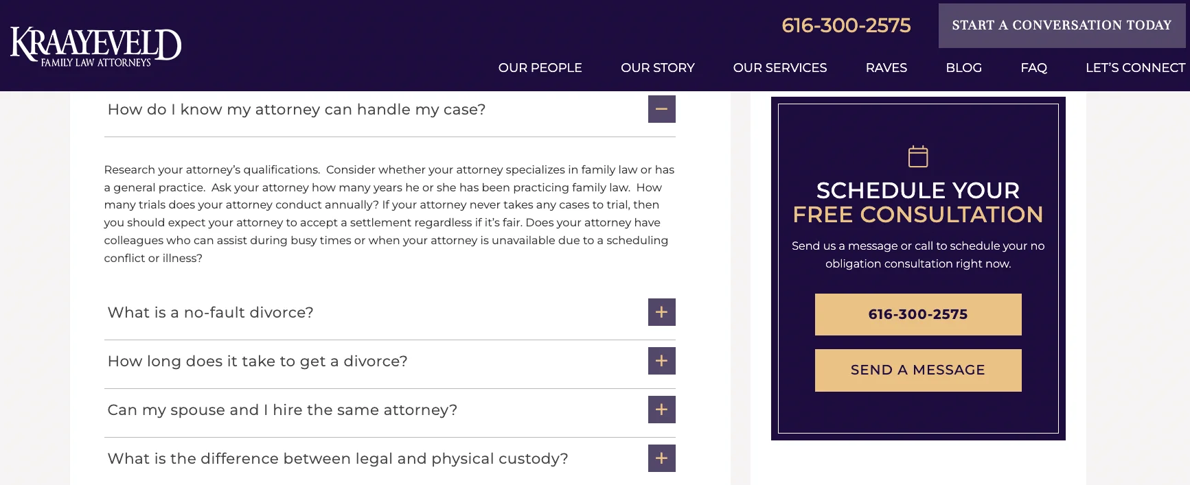
The FAQ page is where you break down your process. If a visitor wants to engage your firm, how do they start? What happens during the initial consultation? How do you determine pricing and rates? What should a client expect while your firm handles their matter? Kraayeveld Family Law uses their FAQ to walk through the process of hiring a divorce attorney. It examines qualifications, ethical conflicts for attorneys, timelines, and some simple definitions. If potential customers can relate to the questions and are comforted by the answers, the FAQ page can be where they start to picture themselves as engaged clients.
Takeaways
These seven web pages are key building blocks for any law firm website. As you build and add to these pages, consider the client experience. Put yourself in the shoes of a potential client and ask what information they would find helpful when hiring an attorney. Ask yourself how they’re feeling. If your clients are often stressed because of their legal matter, consider how your website can be more approachable, comforting, and calming. Additionally, ask what makes your firm unique. Whether it’s your personality or how you deliver your service, embrace what makes you stand out. Make sure that unique element is represented on your website.
Every web page is a proof point for your firm. Whether it’s your subject matter authority or history of proven outcomes, each page makes the argument that your firm is effective and trustworthy. In a highly competitive legal landscape, a well-constructed law firm website reinforces credibility, increases engagement, and results in more leads taking action to hire your firm.
A website is just one element of a comprehensive law firm marketing strategy. If you feel overwhelmed by managing your law firm marketing and intake process, Lawmatics can help. Schedule a demo today to see how the #1 client relationship management platform can work for your firm.


